Some introducing words...
Generally i wanna start by saying that typoholics is looking for quality submissions to our gallery. With the new group system submitting deviations to a group has become immensely easier and resulted in flooded message centers. This group has not been an exception.
Soooo, i made a poll like ages ago, and the felt result is that you would prefer less deviations from this group, but with a higher quality. We will now be taking another big step towards that. Making this group a group for quality typographic submissions.
Meaning: More submissions will be declined.
But with this blog entry we want to give you a look into what we are looking for as submissions to typoholics. You can also look at our Featured Gallery Folder to see in what direction we are heading.
It is sometimes a tough decision why something is accepted and some other thing not. We are 5 people with 5 different opinions. But that is art. It can't please everyone. It is only easy if something is really good. You just look at it and you know it. Same goes for not so good art.
So, when is an artwork good enough to be accepted?
If it has a good concept/idea. If it is visible that you did more than just placing a word on a canvas. If you used all of your options to create the piece. If it is something new or different. If it is balanced. If it's technically of good quality.
There are more things, but what about some examples?
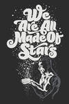
Examples from deviantART.com
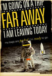
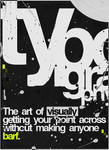
Working with Images
There are many ways to work with images and typography. Make sure image and type go together well and belong together, too.
:thumb100601213:
 :thumb124263537:
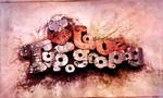
Working with Textures
Applying textures or patterns to your typographic artwork improves depth and "realism" of your piece.
:thumb81937817:


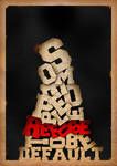
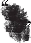
Playing with Letters
Just... take the words apart and throw their letters around


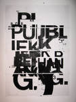
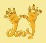
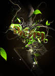
Creating your Own Type
You can use anything to do this: vector illustrations or taking pictures of arranged items. No limits to this.
 :thumb144765492:
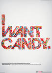


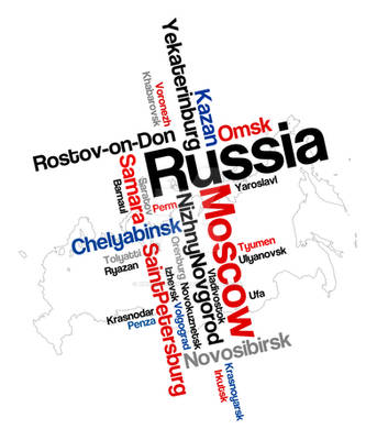
Using Type to Create an Image
Creating an image using words, letters or lines of text.

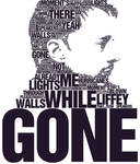 :thumb110924039:
Working with 3D Type


Or Just Do Whatever you want...


 :thumb118339043:


A Good Typographic Artwork needs...
... to be thought about. Take your time, don't rush whatever artwork you are doing.
Be wise when it comes to choosing the right font. Think about what colors you could use. Don't forget the message you want the piece to have. Take a step back, do the dishes, come back and see if you still feel the same about what you just did. Try out a tutorial. Look at other artists, see what you like about their work. Check for spelling mistakes
Just don't write a line of black text on a white canvas and be satisfied with that. There is always something more you can do. Even if it's painful
I want to encourage you to do more than in the piece you did yesterday.
If you want feedback on one of your works...
go to this blog entry